Springtime Spruce-Up
You may have noticed this little site of mine has bit of a new look these days:
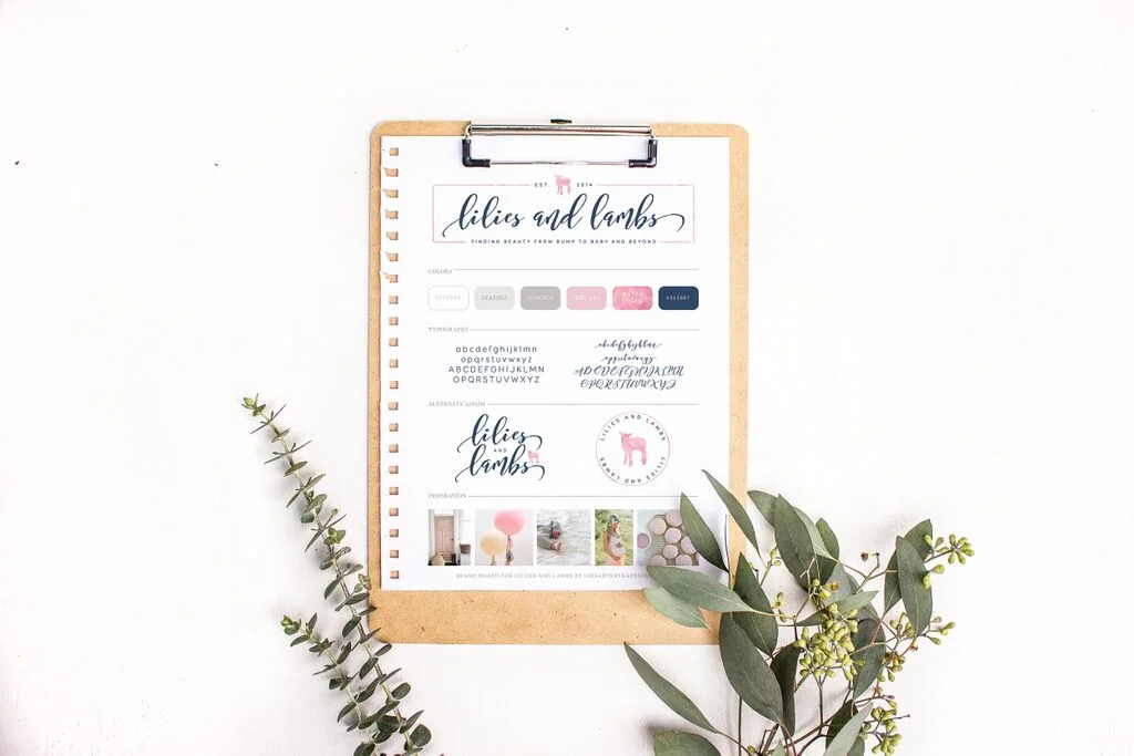
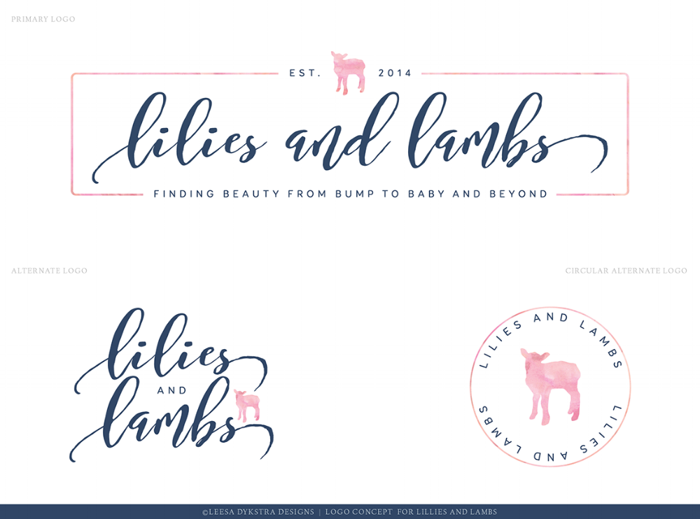
Some fresh new colors- navy, pink and greys, oh my!- and a brand new logo, complete with its very own little lamb. When I started Lilies and Lambs, I never anticipated it would evolve into its own business. Originally, it was just a little hobby of mine- something to keep me busy and inspired as I journeyed into motherhood. Over the last two and a half years, this little corner of the internet has grown in more ways than one- and as such, it was time to elevate its wardrobe a bit.
Over the past few weeks I worked with the very talented Leesa of Leesa Dykstra Designs to design a new logo and brand elements for Lilies and Lambs.
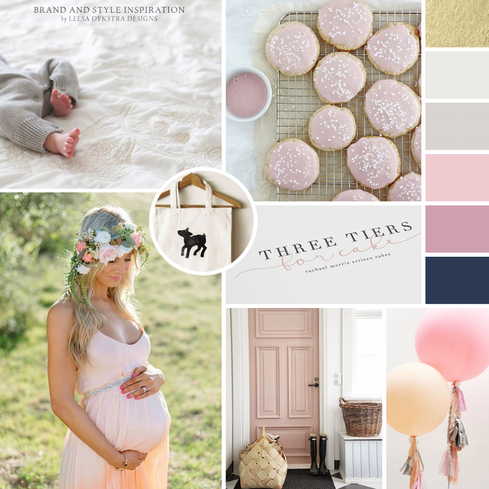
The process was super easy and fun- using Pinterest and a simple questionnaire to inform Leesa's designs. The process of creating an inspiration board for my brand was one I hadn't done before- and one that I wish I had done when I started this site. Creating a visual diary of what I want this space to be was priceless- and not only shared my vision with Leesa, but also reminded me of all the things I want Lilies and Lambs to be.
Leesa understood me and L and L from the beginnings; and I instantly fell in love with her work- her initial brand and style concepts completely embodying everything Lilies and Lambs is and will become.
I'm crushing hard on this new look, and I hope you like it too. Let us know what you think below, and if you're in the market for some graphic design, Leesa's your girl.

